.png)

Vast Topic Section
A school social program that aims to teach students various skills, requires organizing a large amount of information. After completing the information architecture for Sparx, I created a dedicated page for each topic that students might be interested in.
Insight:
The first iteration of the topics page was very long and filled with different types of interests, hobbies, and careers. After extensive organization I was able to narrow it down to 10 main categories, which each have their own sub categories.


User testing revealed two key issues with our posting page: the submit button was small and hidden, and users were unsure if a picture was required to post. We addressed this by making the publish button more prominent and adding a submission policy checkbox that allows users to post with or without an image.
Insight:
Students have the ability to search through any topic. Within each topic they have access to pages of shared and educational content. Students can then choose to explore content created by their piers or post content they want to show off.
Content Sharing
Research
Research Goals
Understand user perspectives between students and teachers.
Identify pain points.
Assess the competitor landscape.
Determine essential features and support that students and teachers desire.
Collect feedback from potential users on their experiences with existing applications and identify areas for improvement.
Teacher Interview Results:
Student Interview Results:
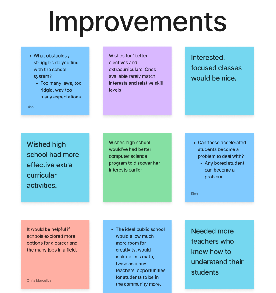
They lack time and resources to help individual students focus on what they are interested in.
Teachers need to stick to the curriculum and most are just trying to get through the week.
Only 50% - 60% of students are engaged in class.
Teachers want there to be more classes regarding trades or real world skills.
Students that were interviewed went to public, private and magnet schools.
Public and Private students felt areas of focus were lacking and they wanted more extra curricular activities. They felt disengaged in their classes.
Students preferred teachers who were experts or professionals in their field and helped to engage with students.
Analyzing some of the most popular educational resources revealed that most applications are focused on a specific niche such as coding, arts, or reading. No application had multiple educational topics that allowed students to share and learn from.
Competitive Analysis
.jpg)
Define
Affinity Diagram
Understanding users needs and paint points.
Persona Development
Building user empathy. Based on patterns from my user insights I developed two personas: A hardworking student who wished her education had opportunities for exploration and a teacher who wants to create more engaging educational material.


Ideation
To brainstorm & decide on features, I came up with ideas using the "I Like, I Wish, What If" method, and a Prioritization Matrix.
Overall we felt that the most valuable aspects of the site would include:
-
Categorization of a wide range of interests, subjects, & hobbies
-
The ability to create custom groups
-
Discussion boards & chat features
-
Custom profile pages where users can showcase their interests, projects and personality
Translating Needs Into Features
Topics & Categories
With the main focus on creating an abundant range of topics and categories for students to explore, we had to carefully brainstorm all possible subjects.
.png)
%20(1).png)
Developing a user flow gave us an idea for how we want our application to function and look like. We wanted to include actions that users deemed as important such as personalization, sharing, collaboration, and learning.
Creating A User Flow


Design & Testing
.png)
Visualizing A New Website
Large websites that contain vast amounts of educational topics and content, make it a challenge for users to find the information they're looking for. Thus, the first step in the design process was to organize and plan out how to visualize all this information.
Site Mapping
After brainstorming and organizing all possible educational subjects, we created a site map to organize each subject and subtopic.
Early Designs
Wireframe designs were iterated upon through usability testing and client feedback, with each iteration improving on visual hierarchy and functionality.
Testing was conducted in-person and on Zoom calls with about 5 participants. During each test the participants would "think aloud" and express their thoughts on each task they needed to complete. This allowed me to observe their interactions with the application.
Background
Sparx is an educational tool that connects students who share various interests and talents. It is a platform that aims to help advance their skills beyond the scope of school standards.
A significant issue in public education is the lack of a platform for talented students to explore their interests, especially since 20-50% of high school graduates are uncertain about their college paths. This case study aims to demonstrate how we can create a platform to support students in choosing future careers.
The Problem
How might we create a product/platform to best connect passionate students socially and educationally, so that they can develop their emergent skills and interests and possibly leverage these connections into careers?
The Solution: Sparx
By providing a solution that educates students on different types of career paths while allowing them to learn and practice their skills and interests.

During user testing we had users:
Log in
Create a Group from their dashboard
Navigate to the vertical bar and find the 3D modeling page.
Create a post to appear on the content page.
We then compiled the insights we learned from these tests to iterate on our final prototype.
Iteration Learnings
Key Insights:
Gap from card
offset on the modeling
page doesn't feel right
Logo should span the full length of the header
Homepage feels crowded and navigation is harder to find as a result
Animations not functioning as intended
Profile popup menu feels too hidden
Content sections on the homepage feel indistinct from each other
Struggled to find publish button when making a post
Issues figuring out if a picture was required to post or not

Exploring UI-Design
While styling the UI-design of our website the biggest challenge that came up was finding a good name. After team brainstorming sessions and voting we decided on Sparx. Originally it was EDU Social, but that name soon became to formal and undesirable to students. They wanted a name that sounded friendly and explorative.
We stuck with blue accents because it represented educational colors and cool/relaxed emotions.
High-Fidelity Designs

Reflection
Looking Forward
After working on Sparx, I discovered some future iterations we could create or fix in the future:
-
A platform like SPARX can be modified for different versions. (ex. homeschool vs. a public school)
-
Creating a SPARX experience that has different levels of permissions based on age, parental controls, etc.
-
A utility to match tutors with students.
-
Plugin features such as music recording studio, Figma-type collaboration software, etc.
-
UI flow that accentuates learning and discourages use as a regular social media feature like Snapchat.
-
Broaden the participant pool: Include a more diverse range of students and teachers in user interviews and usability testing to gain a better understanding of resource gaps in public schools.
-
Combine research methods: Use a mix of qualitative and quantitative data collection methods for more robust findings.
-
Involve key stakeholders: Engage school administrators, parents, and policymakers in the research process to gather valuable insights and develop more practical recommendations.
Personal Learnings
Community Focused Home Page
Sparx is a student-focused app that lets students access, share, and explore academic work and interests. The homepage highlights these features, while the left sidebar provides easy access to various needs.
As an educational platform with extensive information, we initially faced overcrowding on the homepage due to the wealth of data. However, after multiple user tests, users preferred streamlined access to features like viewing other students' posts, tracking school activities, and engaging in chat discussions.
Insight:
.png)
Home v1
.png)
Home v2
.png)
Home v3
